
Tiny Bites but Big Love from Smoochy
- Mar 4, 2024
- 3 min read
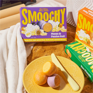
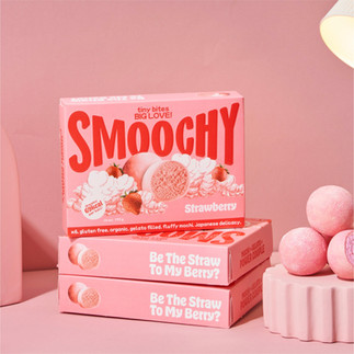
Smoochy, Egypt’s first mochi supermarket packaged brand, blends between artistry and flavour in its soft mochi kisses. Born from a passion for infusing love into every bite, Smoochy aimed to revolutionize the traditional Japanese delicacy, creating a visually indulgent packaging design.
A packaging that doesn’t just sit on the shelves; but one that orchestrates a visual symphony that captures attention and tells a story, conveying the promise of an indulgent and kissable experience within. Smoochy aspired to be the “Wonka of Mochi.” Infusing the brand with the same enchanting and whimsical spirit that has made Willy Wonka’s creations timeless. Setting the stage for a versatile and timeless design that could effortlessly adapt to various flavours and standing the test of time.
The fledged out logo, an asterisk grid, is not just a symbol but an elegant punctuation mark in the language of design. Inspired by the classic emoticon for sending a kiss, the logo grid evolves into a visual journey of a smooch – from the subtle plucking movement of lips to the blissful release at the ends. The logo is not static; it’s a playful statement that encapsulates the essence of a mochi kiss. The slight embossing with a shine and chrome texture elevates it from a mere symbol to a tactile experience, inviting consumers to touch and feel the love imbued in every bite.
The choice of a lively and dynamic colour palette is intentional – its an invitation to a world where each flavour is a note in a melody of delight.


At the heart of innovation lies the Cloud Symphony – a captivating fusion of real imagery and sketched clouds that transcend the conventional boundaries of packaging design. These whimsical sketched clouds not only symbolize the heavenly taste of Smoochy but also play a dynamic role in the visual narrative. Each pack is a canvas of dreams, with real mochi flavours dancing on clouds that change shape and form, creating an ever-shifting spectacle across the product line. This dynamic interplay of the ethereal and the tangible is not merely a design choice; it’s an immersive journey into the magical realm of mochi, making the choice of flavour an enchanting experience in itself.
Tasked with establishing a presence in an untapped market, the design team embarked on crafting visually captivating packaging. Marked by a dynamic asterisk-kiss inspired logo, elevated through embossed textures, that beckons consumers to physically engage with the love-infused mochi experience. The design’s innovative touch extends to whimsical heavenly clouds and floating mochi, creating a mesmerizing spectacle that evolves across various flavours. A vibrant colour palette, akin to a symphony, promises an indulgent journey with every hue representing a unique note. Each package becomes an artful canvas, where mochi flavours float on ever-shifting clouds, fusing the ethereal and tangible in a magical experience. Overcoming the challenge of market differentiation and simplifying consumer choices, the design team used the storytelling device, guiding consumers to visually connect with the variety of mochi flavours and making the selection process more intuitive, establishing Smoochy as a ground-breaking, pioneering brand, visually distinguished on the shelves.


The overwhelming market response, fuelled by viral success and consistent sell-outs, underscores the project’s triumph in introducing the cherished Japanese delicacy to Egyptian consumers through a creative and visually enchanting packaging design.
The hashtag #smoochy on TikTok trended for “taste test” videos in Egypt, with users specifically praising the captivating packaging design.
Smoochy not only introduced a beloved Japanese delicacy but also became a pioneering brand in the Egyptian market, celebrating love through heavenly mochi kisses.
Buzz & Co. - https://buzzand.co
Coupled with the choice of Hobeaux and Mochiy Pop One typefaces, aimed to capture the whimsical personality of Smoochy. The lively colours orchestrate a visual symphony, while Hobeaux mirrors the malleable texture of mochi, Mochiy Pop One establishes a cultural connection, bridging tradition and modernity, conveying the youthful energy and authenticity
Coupled with the choice of Hobeaux and Mochiy Pop One typefaces, aimed to capture the whimsical personality of Smoochy. The lively colours orchestrate a visual symphony, while Hobeaux mirrors the malleable texture of mochi, Mochiy Pop One establishes a cultural connection, bridging tradition and modernity, conveying the youthful energy and authenticity


Comments