


Perfection is losing its appeal?
Is ‘flawless’ a thing of the past?
In an increasingly digital world, the desire for authenticity, individuality, and tangible experiences is growing. The trend team at surface finishing specialist Leonhard Kurz has explored how this societal shift is influencing colours, materials, and packaging. At the recent Luxe Pack Monaco, the company showcased four current design trends, presented in the ‘60° number three – creative boxes to inspire’ format.
Today, digital images and visual concepts can be created and perfected in next to no time. At the same time, there is a growing desire for the opposite. Objects with character, materials that can be physically experienced, and designs that do not appear infinitely reproducible.

This shift is also influencing packaging design. The Kurz trend team has been studying societal and design developments for many years. For ‘60° number three,’ the team identified four movements that point to a common development: Design is becoming less focused on perfection and more focused on meaning.
The four trends demonstrate the wide range of responses to increasing digitalisation and complexity.
‘A Place Called Culture’ deliberately looks beyond the mainstream. Subcultures and alternative lifestyles inspire raw, dark, and imperfect designs that express individuality and attitude.
‘Hive Mind’ contrasts rapid technological development with a fundamental human need: genuine connection. Technology and humanity merge in design just as they do in everyday life.
‘Néon Brutalism’ moves away from flawless surfaces. Materials are allowed to reveal their origins, while textures and traces of the manufacturing process remain visible. Imperfection is not concealed but becomes a sign of authenticity.
‘Soft Resilience,’ by contrast, responds to feelings of overwhelm and uncertainty. Soft shapes, tactile textures, calming colours, and playful elements convey a sense of comfort and lightness.
‘At first glance, the four trends look very different. But they are all driven by the same question: In an increasingly digital world, what do we still perceive as authentic and valuable? We are seeing individuality, the physical experience of products, and emotional impact become increasingly important. This is exactly what we want to make visible and tangible in packaging,’ said Julia König, head of design packaging and print at Kurz.
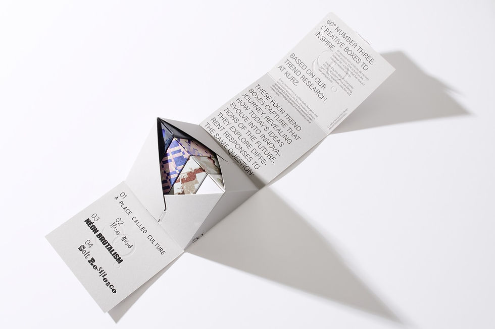
The company demonstrates what this can look like with four creative boxes from the latest 60° series. The experimental packages serve as three-dimensional canvases for the respective trends.
In developing them, the design team deliberately broke with a familiar principle: packaging is usually designed one side at a time. In the new concepts, abstract patterns instead extend across the entire package. There is no predetermined top, bottom, front, or back. The visual effect changes depending on how the box is viewed.
The designs themselves were also initially created by hand. In the age of generative AI, this was a deliberate choice: The human touch is not meant to disappear, but to remain an integral part of the design.
Fedrigoni makes a significant contribution to the distinctive tactile and visual quality of this year’s trend boxes. As the project’s paper sponsor, the Italian specialty paper manufacturer provided the premium materials used for the boxes and the four individual trend worlds. With their distinctive surfaces, colors, and tactile qualities, the papers were carefully matched to the different design concepts.
Fedrigoni Sirio Rough Perla 350 g/m2 was used for the outer boxes. Each of the four trends has its own distinct paper character: ‘A Place Called Culture’ features Materica Ardesia 250 g/m2, ‘Hive Mind’ uses Sirio Sale Rosa 210 g/m2, ‘Néon Brutalism’ features Tintoretto Ceylon Cumino 250 g/m2, and ‘Soft Resilience’ uses Freelife Kendo 250 g/m2. This makes each trend world an experience not only visually, but also through touch.
‘Paper is more than just a surface – it gives colour, texture, and character to every creative expression. For ‘60° number three – creative boxes to inspire’, we carefully curated a selection of papers to bring each trend to life. At the heart of the project is Sirio Color, our iconic range of uncoated coloured papers. We complemented it with Materica, with its distinctive mineral depth, and Freelife Kendo, with its soft, natural feel. Combined with Kurz’s finishing expertise, the collection demonstrates the creative possibilities that emerge when papers with distinctive character meet advanced finishing techniques. We are proud to be part of this inspiring collaboration,’ said Charlotte Courtot, senior trade marketing manager and luxury, Fedrigoni Special Papers.
In addition to the packaging concepts, Kurz presented eight new trend colours. The palette ranges from intense green and transparent electric blue to beige and earthy tones, as well as the pink and silver Bubblegum Dust.


Comments